 Skip to content
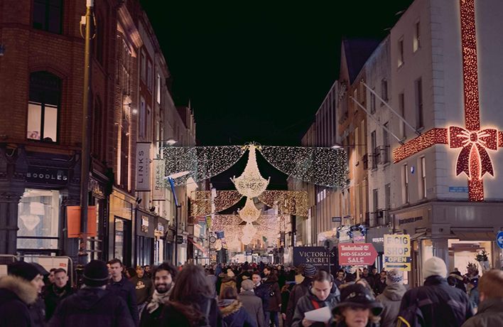
As we’re sure you’re fully aware, running a business can be a major challenge at the best of times, and Black Friday is no exception.
A lot of business owners fail to realise how important it is to engage visitors with their website design. Many find it ‘easy’ to bring the right people to their website, but their conversion rates tell a completely different story.
As visitors head over to your website this Black Friday, it’s crucial to recognise that the user’s experience does matter and that an enjoyable experience can grow your conversion rates this holiday season.
If you are unfamiliar with CRO and you are unsure of where to start, investing in a reputable CRO agency will help you to continuously improve conversions on your website.
In this article, we’re going to give you our 10 best ways to capitalise on Black Friday’s massive influx of online shoppers and boost your conversion rates, without spending more money.
1. Make Your Website Navigation ‘User-Friendly’
Have you ever been in a situation where you visit a website, spend a bit of time on a page, and suddenly you want to get to a certain page or perform a task, but you are completely lost not knowing where to go? We have.
Your navigation should guide your visitors to the key pages you want them to land on. The navigation should have a clear visual styling that stands out from the rest of the website/ page design because you want people to notice it.
To make your navigation more visible this Black Friday:
- Don’t use tiny menus (or menu icons) on large screens. Menus shouldn’t be hidden!
- Put your menu in a familiar location. People expect to find elements where they’ve seen them before on other sites or apps. Use these expectations to your advantage by placing your menu where people expect to find it. i.e, left rail, top of the screen.
- Make menu links look interactive. People may mistake your menu for a banner if it has too many images, and doesn’t look clickable or tappable. Also, if the menu has a submenu, put arrows next to the categories so that people know there’s more to come.
- Ensure that your menu has enough visual weight. Make sure that your menu isn’t lacking visual emphasis and that it’s not easily lost in a sea of graphics, promotions, and headlines.
- Make sure the colour of the text contrasts with the background colour. We cover colour in more detail later on.
- Coordinate Menus with the user’s habits/ journey.
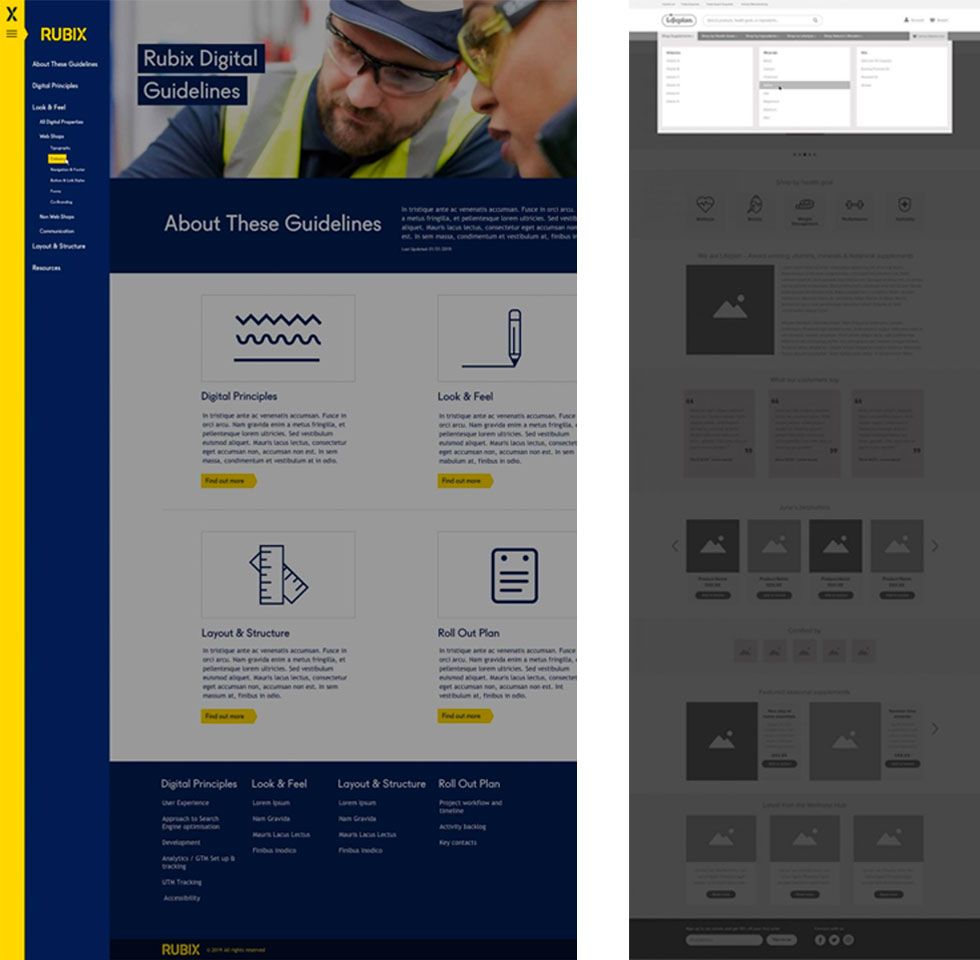
Here is one of our favourite examples of a navigation menu that we’ve designed for one of our clients:
2. Use Big, Bold Typography
Bold typography sends a clear, strong message. It’s an easy and clean way to make what you have to say a focal point. It’s symbolic of the saying ‘more with less’.
Bold typography is easy to read and catches a visitor’s attention. If you can capture your visitor’s attention, they must just stick around long enough to take a look at your product or service.
Here are some great examples:
3. Add Testimonials, Reviews, and Logos
No one wants to be the first person to use a product or service! So put your visitor’s mind at ease by providing testimonials and reviews from past customers. People read reviews before they decide to purchase or use a service.
Glowing reviews improve conversion rates. If you have happy past customers, ask them to write a review of their experience. Also, make sure to reply to people who leave a review. A quick ‘thank you’ will go a long way in building a personal connection and increasing brand loyalty.
4. Use Human Nature to Your Advantage
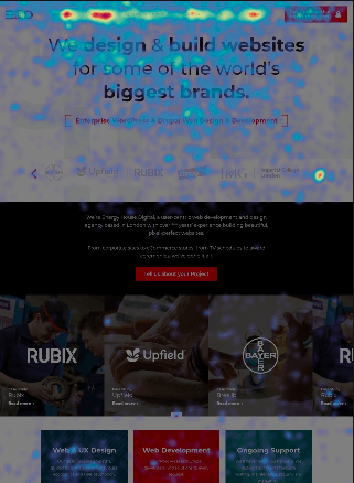
- Consider Using an F-Layout or Z-Layout. What do we mean by this? People’s natural behaviour when browsing a website is to read the screen in an “F” or “Z” pattern. We’ve put an example below, so you can visually see how people naturally view our website:
- Remember that the length of a human attention span on average is 8 seconds, which is shorter than the attention span of a goldfish! Crazy right? This is why every point that we’ve listed in this article is to help you capture and maintain your visitor’s attention.
- People love human faces, so use faces where possible to increase familiarity. When people see a face, they are automatically triggered to feel something or to empathise with that person. So use this to your advantage to help people recognise, connect, and understand the content on your website.
5. Colour Matters
Understanding the fundamental basics of colour, and how to use it wisely throughout your website design can optimise results, especially for peak holidays like Black Friday. Colour is one of the most powerful tools in website design. On a website it’s used to:
- Attract attention
- Express meaning
- Create desire
- Drive conversions
- Earn a customer’s loyalty
Choosing a colour takes careful planning, and when done correctly it can influence how a visitor interprets what they see – in relation to layout and copywriting as well.
How to use the anatomy of colour this Black Friday:
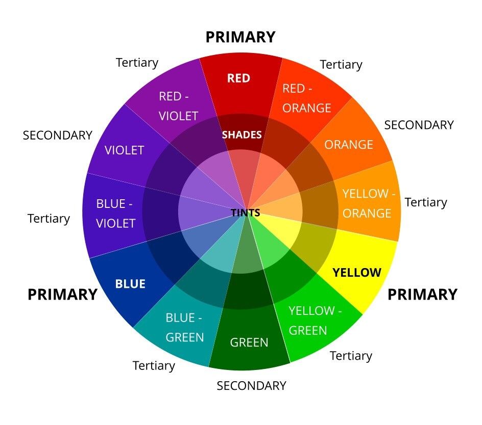
The colour wheel
To be exceptional this holiday, you first have to know the rules and theories of colour selection:
For great user experience, we suggest using colours that ‘compliment’ each other. The easiest way to pick a colour blend or palette is to utilise the colour wheel and implement analogous, monochromatic, complementary and triad colour harmonies. This sounds more technical than it actually is, we promise.
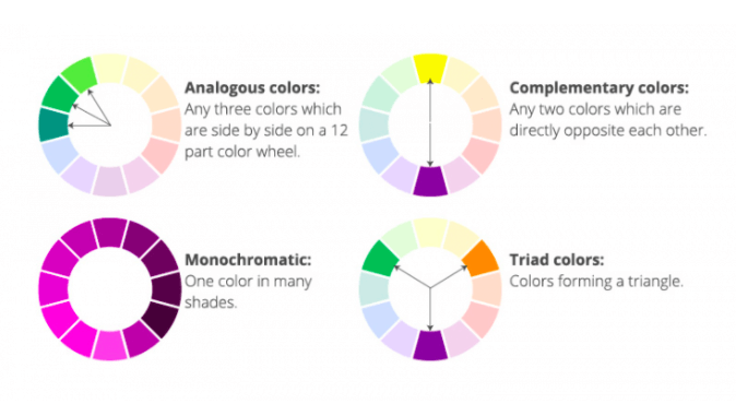
How to Pick Colour Harmonies
Why is this important?
- Branding: If you have a well-known business, start with colours that are on brand and then slowly introduce new ‘pops’ of colour.
- Your Audience: The chosen colours need to reflect the audience you’re trying to attract this Black Friday. The colours you choose represent the emotions that your brand intends to convey. Before Black Friday, make sure you know your target demographics and research what they respond to, this will help you to pick some colours that will grab their attention – whether through ads, content, banners or buttons.
- Trend: Understand colour trends. This gives you great insight into what’s coming ‘down the pipeline’, helping you create a website that is new, progressive and ‘trendy’.
- Emotional: Consider what kind of emotional response you want people to have.
- Balance: Think about the colour harmonies. When deciding on a colour palette begin with a dominant colour. Then start to layer your palette. Be careful about using too many colours as they can start to compete with one another, which can cause eye fatigue and overwhelm your visitors.
6. Keep it Simple
In web design, more isn’t always best.
Although you may be tempted to place lots of great content on your page for Black Friday, a busy and cluttered design can overwhelm and be a huge turn off for visitors.
A simple, clean and straightforward design is easier on the eye and helps your visitors see what you have to offer, and hold their attention which can lead to higher conversion rates. You want your site to be simple and fast.
Simplicity is the best practice.
7. Make It Mobile Friendly
Google favours sites that prioritize mobile experience.
A lot of people nowadays search for and purchase products/services on their phones, tablets, and other mobile devices. If your mobile site doesn’t match your desktop site and a visitor can’t fully access your page on their mobile device, then you’re losing business.
If you are behind in this area, it’s time to make sure your site is mobile-ready.
8. Strengthen Your CTA Copy
Generic call-to-actions on Black Friday like “Sale” and “Buy” won’t give you the best conversion rates.
A few minutes spent improving the copy will give you an easy conversion rate win.
Make sure your CTAs are highly effective in length, tone and power words. Psychologically, making your CTAs value positive and engaging will paint your Black Friday offer in a positive light.
9. Add a Countdown Timer
Black Friday is a limited offer, so it should be treated like one.
It’s natural to become anxious when time is running out. Adding a countdown timer to your landing page may be just what you need to capitalise on this feeling.
If users feel like they’ll miss out on your amazing once in a lifetime deal if they don’t act now, using a limited-offer sign with a countdown timer is a huge win. Thus creating a sense of urgency by adding a countdown timer, which should only take a few minutes, can immediately boost your conversion rate.
10. Respect Users’ Patience
Rather, their impatience. As it turns out, people are very impatient – especially when it comes to web browsing.
So when it comes to user experience on a website, every second counts. In terms of page loading speed, you should regularly check your page speed and troubleshoot any issues.
-
- Improve the Speed of Your Website by:
- Improving server time
- Optimising your images
- Reducing redirects
- Minimising coding
- Using compressed files
- Eliminate/ Minimise Anxiety
- Improve the Speed of Your Website by:
When a visitor lands on your page they might be wondering?
- Where am I?
- What should I do?
- Why should I do it?
So when designing your page, always ask yourself these questions:
- What is the purpose of this page?
- Why does it exist?
- Why should visitors click here?
- How does this page help the visitor?
This will combat any worries or anxiety that your visitors might have on the page by making sure that you understand what they need before they need it.
-
- Remove unnecessary form fields
Have you ever gone to fill out an online form, and have been scared away by too many required fields? It’s more common than you think. It’s one of the best ways to kill your conversion rate. Remove all unnecessary form fields, leaving only those that are essential to accomplishing your goal.
Unfamiliar or unsure of where to start? Invest in a reputable CRO agency to continuously improve conversions on your website.
